Painting the Town Red
In theory I should have a Woodbury category, if I’m going to do PCC and CSUCI on their own. But that just complicates distinctions between writing and other work. Besides, I never finished that program anyway.
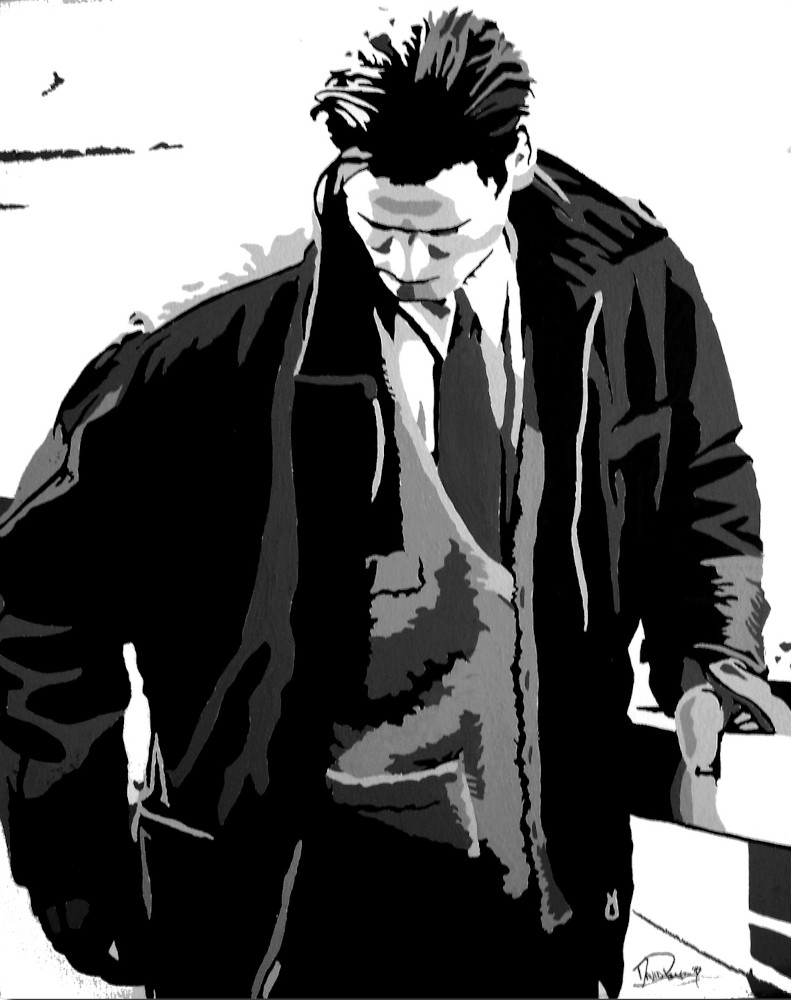
Graphic Design at the time was as much Aldus as it was Adobe. Only a few courses were in the computer lab, most of it was still out in the studios. Some photography, some drawing, some painting, a mix of stuff that produced a few highlights. These are all gouache on board, circa ’94…

The assignment here was posterization. Take an image and break it down- first into BW, then greys, then a color variation. The campus library had these big Euro fashion mags for all the ennui we could handle. The BW of this image looked boring and the color came out pretty badly, but I’ve been a fan of this one since the moment I finished it. I liked it so much and enjoyed the process that I kept on going and did a few more just for fun.

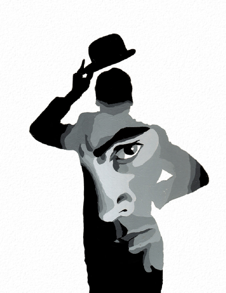
The original here was from an RDJ interview in Details for ‘Chaplin’. This was tougher than I expected- the original had shades I couldn’t pick out while mapping my colors, so the first pass looked very flat and plastic. I had to go in on the fly to add in shades I honestly wasn’t seeing in the original, just to make the copy represent.

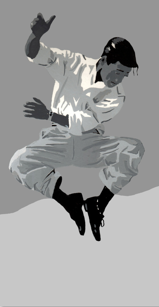
Sammy! Not really. The Gap, actually. And a royal pain, with all of that texture in the clothing. Big chunks of that shirt are nothing at all, just some grey against the bare board for shape. But the pants got away from me, just so much going on. I was mixing out shades as I went, adding white and working from dark to light, when I goofed and made the dominant dark shade too close to the surrounding background shade. Stepping back, his legs became sticks of highlight. But I’d shaded so much of the pants that they were more or less set. I wound up lightening the shade between the legs just a bit, to bring out the difference. Luckily it doesn’t stand out :)

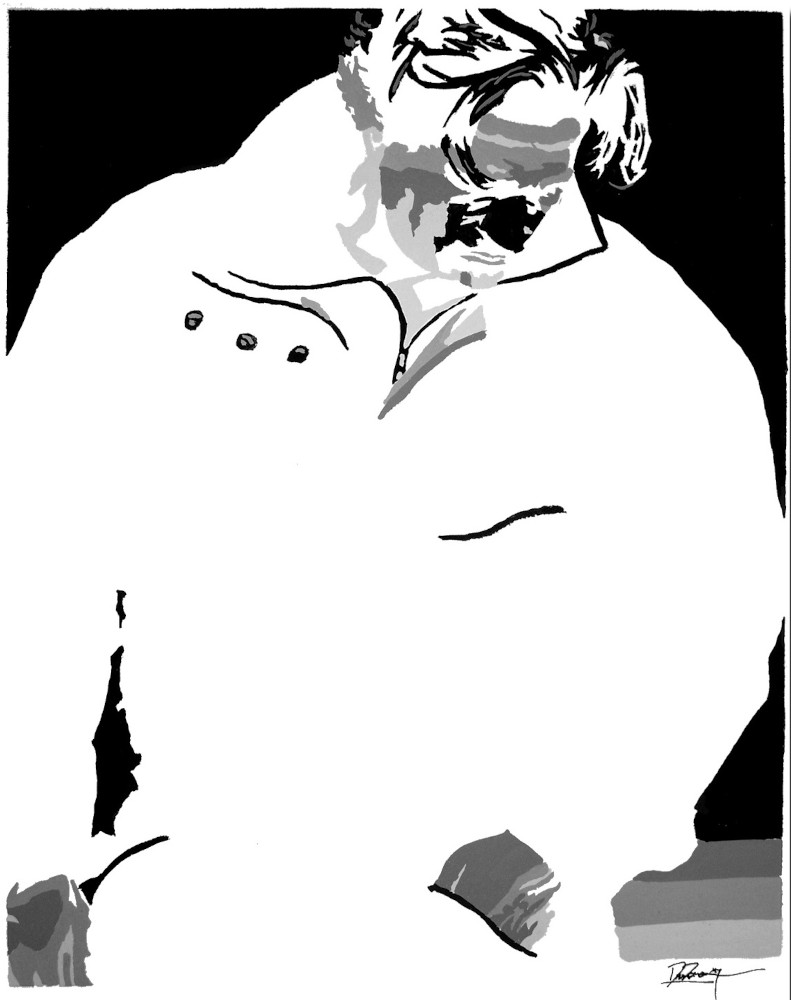
I really wanted to paint this one, the textures and shapes were just too interesting. Unfortunately I was almost out of paint, after first tackling the other images. And this one was ALL black, and I was broke. So for fun I made it a negative of the original, and its fantastic. Put next to the first image it’s an excellent complement between color, shape, and pose. On its own the shapes in there were a maze- on their own, none of those grey blotches look face-shaped, but they play together perfectly. If It’s had the paint and done it as originally intended, I probably would have hated it. Too black, too monolithic. but the negative space works.
There was one more I did, a postcard-sized pic of Nic Cage looking cool in this diner-kinda seat thing, but I gave it away. (She was a Nic Cage fan.)